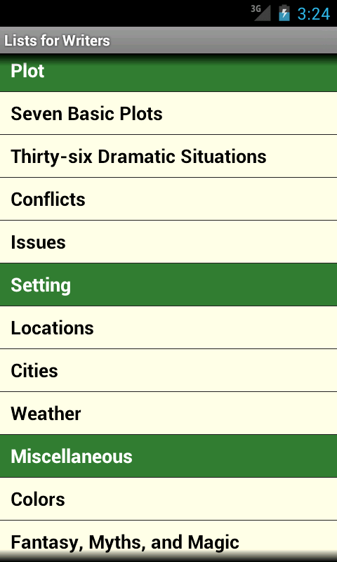
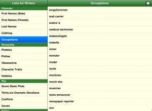
 Our first published app, Lists for Writers, isn’t the most exciting, development-wise. It isn’t the first app we started but it’s the first one we “finished.” It seemed simple enough to develop quickly [hah!] and we needed to learn the app launch process.
The app really started with a collection of lists I had accumulated (instead of actually writing) during National Novel Writing Month (NaNoWriMo). We liked the idea of having those all rolled into an app where it would be easy to quickly find a name for a character or look at Polti’s thirty-six dramatic situations. The result is this app.
The UI is not too much more than the iOS Master-Detail template. I added a “further detail” view for a few lists where the single tableview cell isn’t enough space, especially on the iPhone in portrait orientation. There were a few struggles like changing the background color of the section headers. That requires completely rendering the view for the section header rather than just setting a property on the table view. I also struggled with showing the master list table in portrait mode on the iPad. You can simply send a setHidesMasterViewInPortrait:NO message to the splitViewController to show the master view but that’s still a private API and Apple rejects plenty of apps for using it. So ultimately I pulled that and the master list is still a pop-over like the default template. There are several free alternative split view controllers and I’ll probably switch to one of those in a future version.
I also had an issue with Google Analytics. I initially had it in the app so we can see which lists were getting the most use, which devices were being used, and just to see how many people were using the app in general. But I read enough posts from people getting rejected from the store for using analytics that it wasn’t worth the risk. I’ll probably stick them into a future app update when a rejection won’t affect us as much.

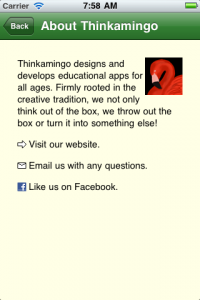
The most development time was actually spent on our “About Thinkamingo” view. I went through about five iterations of it, starting with a table view then a few labels. Ultimately all the content is in a web view. That makes it easy for the text to flow smoothly, even when rotated. There is some complexity to the links because I used canOpenURL to check if they have the Facebook apps installed and will use the app to open our Facebook profile instead of using Safari. I had a similar Twitter link but removed it for space. (There is frustratingly little screen space in landscape mode on the iPhone.) The web view needed a little work. I had to track down a trick to prevent the view from “rubber band” bounce scrolling when touched, which is awfully ugly on an embedded web view. The last thing to go into the app was our icon. We were stuck waiting on a graphic designer but had to go ahead and drop in a flamingo sketch I did as a placeholder. Our next update will switch over to our new logo.
Other than that, we spent a bit of time on the lists – editing them, parsing them, removing a few philias and other terms that weren’t kid-appropriate. We have a few additional lists and ideas for more that we hope to add in the future.
 Our first update of Lists for Writers is now available in both the iTunes App Store and the Amazon Appstore for Android. The update adds some additional lists that users have suggested:


